
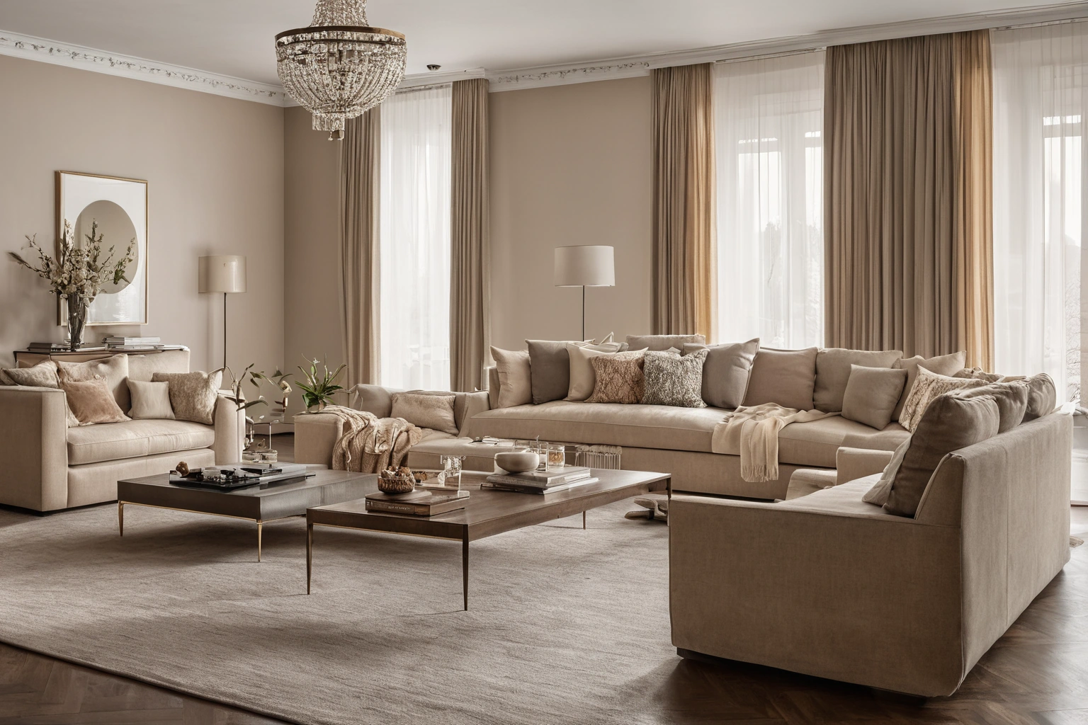
Sarelli Textiles presents fabrics and rugs for interior projects. A historic pattern can sit comfortably in a contemporary room when its color, scale and placement respond to the room as it exists. The useful question is not whether a textile is labelled classic or modern; it is what the textile contributes among the walls, furniture, floor and light.
Start with the object, not a style label
“Classic fabric” is a broad description. It might refer to a damask structure, a scrolling motif, a velvet surface or a particular historical reference. These are different qualities. The Metropolitan Museum of Art catalogues an early eighteenth-century furnishing damask as a woven silk textile; another collection entry describes Ottoman velvet used in furnishings such as cushions and curtains. Those records show why a term on a mood board needs a material sample and a more precise description before anyone can specify it.
A modern color scheme is equally specific. It may be restrained, but it need not be pale or monochrome. Think of the palette as a set of relationships: the largest field, the supporting color, the accent, and the materials that shift those colors through texture. A quiet wall can carry a strong historical pattern on a chair. A richly colored wall may need a lower contrast pattern to keep the room readable. Either route can work if the pattern has a clear role.
Separate motif from color
When a traditional pattern feels too formal, the problem is often its contrast rather than its drawing. A scrolling motif in two nearby tones reads differently from the same motif in black and white. A damask may create its pattern through the way the weave catches light rather than through a printed outline. Try the candidate at viewing distance. If the motif disappears from the doorway but provides interest close to the seat, it may support a calm scheme. If it dominates every sightline, give it a smaller area or simplify adjacent surfaces.
Choose one clear anchor in the room. This might be the rug, a painted cabinet, a stone surface or the textile itself. Pull a supporting tone from that anchor, then compare actual samples together. Avoid matching by a screen image alone: a phone does not show pile direction, weave sheen or the way a surface changes between morning and evening. The U.S. Department of Energy notes that a light’s own color appearance differs from how it renders the colors of objects. Its LED basics explains why two rooms with similar lamp descriptions can still show fabric colors differently.
Use scale to set the rhythm
Pattern scale determines how the eye moves around a room. A large repeat can be effective on a broad curtain where the full shape has room to appear. On a narrow dining chair back, the same repeat may be cropped into an unrecognizable fragment. A small allover pattern can help a seat feel continuous, but on a long drape it may become visual noise. Ask for the repeat dimensions and lay a full-scale print or large cutting against the intended piece of furniture.
Consider pattern orientation as carefully as size. A vertical stripe can relate to the height of a window; a centered medallion may need deliberate positioning on each chair back. A directional pile or one-way motif can affect cutting plans and the appearance of neighboring pieces. The Association for Contract Textiles’ voluntary quality guidance distinguishes usable width, repeat and pile direction. These are production details with visible design consequences.
| Placement | Color approach | What to check |
|---|---|---|
| One accent chair | Echo one room color, allow a stronger motif | Motif position on back and seat |
| Full-height curtains | Reduce contrast if the wall is already active | Repeat, stack and daylight appearance |
| Bench cushion | Use a calm ground with one distinctive detail | Wear category and seam placement |
| Small pillows | Test a bolder accent without committing a large area | Scale at the actual pillow size |
Let texture carry some of the history
A classic association can come from surface rather than ornament. The Met describes a late fifteenth- to mid-sixteenth-century Florentine furnishing textile in velvet with metal-wrapped threads. Recreating its material or richness is not necessary in a contemporary space. The lesson is that depth, sheen and shadow can carry visual character. A current room might use a quiet velvet alongside plain linen-like curtains and a matte wall. The surfaces do different jobs without repeating the same motif.
Balance matters more than a formula. Place glossy and matte samples together; step back; then look from the doorway and the seating position. If every surface reflects light, the room may feel busy even with few colors. If every surface is flat, a patterned textile can supply needed depth. This is a composition judgment made in the actual light, not a fixed rule that velvet must always be paired with a specific material.
Build a sample board that can be judged
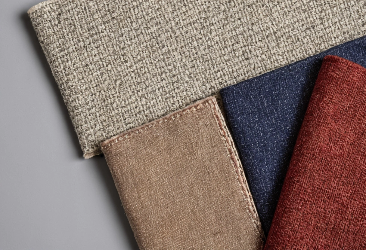
Put the proposed fabric beside the actual paint, wood, metal, stone and rug samples. Keep a large neutral card behind them, then repeat the comparison against the wall where the textile will be installed. Small swatches should be backed by a larger cutting before final approval, especially if the repeat is large. Photograph the group in natural and electric light, but use the photographs as a record rather than a substitute for looking at the material.
Try one removal test. Take away the classic patterned fabric. Does the room lose a needed focal point, or does it become calmer and more coherent? Then return it and remove one competing accent. Often the issue is not the historic textile but a second pattern that asks for equal attention. A palette becomes legible when one textile leads and others support it.
Specify for the application
Visual success is only part of the choice. Upholstery, drapery and decorative cushions have different demands. Ask the supplier for the fabric’s intended application and current performance information. ACT organizes voluntary guidelines by fabric construction, intended application and location, and separates abrasion, lightfastness, colorfastness and physical properties. A curtain fabric with a compelling motif should not automatically move onto a frequently used chair. ACT’s framework makes the distinction explicit.
Before ordering, confirm width, repeat, direction, cutting allowance and care guidance with the maker. If several chairs are to match, agree on where the motif will sit and whether an acceptable variation is allowed. If the design relies on a particular shade, approve a current cutting rather than an old photograph. These practical checks protect the visual decision: the installed room should have the same rhythm and color relationship as the approved sample board.
A classic fabric in a modern scheme works when it has a defined role. Choose its area, tune its contrast, give its pattern enough room, and let the surrounding surfaces help it read. The result can acknowledge a long textile history without copying a period room. The test is simple: the material should look intentional in the actual light, on the actual form, at the actual scale of the room.
One final comparison should be done at the scale of the finished object. Put the patterned fabric over a chair back or hang enough length to show several folds. Place the plain supporting textile beside it, then move to the room entrance. If the classic fabric is still the intended focal point, note which part of its motif should face the room. If it becomes visually fragmented, reduce the patterned area or choose a smaller repeat. This trial is more revealing than adding another palette image to the mood board because it tests the real relationship between pattern, furniture and distance.